|
|
TODAY.AZ / Weird / Interesting
Youtube changes logo first on mobiles
30 August 2013 [15:10] - TODAY.AZ
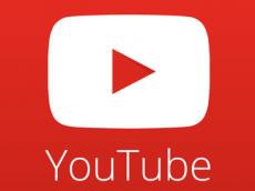 YouTube has surreptitiously unveiled a striking new logo that does away with the plump, simplistic lettering that it`s used for years now. In its place, the new logo features a two-tone red and white design that largely focuses on a flattened play icon, with thin lettering below it for the website`s name. The logo first appeared in the redesign of YouTube`s Android and iOS apps last week, and it`s since shown up on its Facebook page and Twitter profile — though notably, not on YouTube`s own website. We`ve reached out to confirm whether this is a true redesign in the works or just an alternate logo.
The logo for YouTube hasn`t changed much over the years — it`s long used a wordmark partially encapsulated in a big red bubble. The bubble has lost some of its gloss, but it`s largely remained the same despite being fairly indistinct outside of its split-apart look. The apparent rebranding effort may allow YouTube to be associated solely with a big red-and-white play icon, which could be seen as a stronger way to represent itself than solely its name. The icon also falls more in line with design styles of late: aside from echoing the flattened looks present in iOS 7 and Windows Phone, it notably falls in line with other Google services' Android icons, particularly Chrome and Drive, both of which are simple and feature subtle shadowing, as YouTube`s new logo does within its arrow.
/AzerTAg/
URL: http://www.today.az/news/interesting/125781.html
 Print version
Views: 2135
Connect with us. Get latest news and updates.
See Also
- 29 June 2026 [08:00]
Marie Curie's notebooks remain radioactive more than century later - 28 June 2026 [20:00]
Shahdag Tourism Center opens summer season with new opportunities for visitors - 28 June 2026 [19:15]
Shirvan Plain: Living landscape of rare plants and changing ecosystems - 28 June 2026 [14:05]
Azerbaijani culinary heritage and culture highlighted in France - 31 May 2026 [14:19]
Shamakhi Astrophysical Observatory releases space weather forecast - 31 May 2026 [13:30]
Azerbaijan plans major step in digital development with Supercomputer Center - 26 April 2026 [23:00]
Time to apply brakes to runaway AI, says pioneer - 26 April 2026 [22:23]
Chinese scientists discover two new lunar minerals - 19 April 2026 [00:18]
Swedish king controversy reveals monarchy’s democratic contradiction - 09 April 2026 [14:25]
Lyrid meteor shower to light up sky
Most Popular
 And Burkina Faso slammed the door: the collapse of French politics in Africa
 Paris wanted to enter the Middle East without knocking – and got it from Tehran
 Azerbaijan Army enhances officer training with specialized demonstration classes
 To revive the "dead man" - who and how in Armenia is holding on to the separatist project
 Europe remains critical hub for U.S. military operations, Rutte says
 Ukraine expands deep-strike campaign with attacks on Russian military sites
 Ukraine seeks French license to produce SCALP cruise missiles